I have managed to create another survey to help me find out what content I should use for my front cover. However, I have only asked 15 people who have interest in art, so that it is quicker for me to gather the answers. And these are the questions I have asked:
1. If you were to buy a art magazine would you prefer to read about : ( in this questions each person could choose 3 things)
- Famous Artists/ Designers/ Photographers from around the world = 7
- Different techniques and styles used in art = 9
- Upcoming exhibitions and art events = 8
- List of contests you could sing up for = 8
- How to use art equipment well = 2
- How the school is doing and what is planned for the next term = 5
- Tips on good preparation for exams and assessments = 6
2. Would you like if the magazine would include more pictures than the text ?
Yes = 6 No = 3 Balance between both = 6
Monday, 11 October 2010
My Ideal Reader
Considering last lesson, I have decided to identify the ideal reader for my college magazine. To begin with I already know that the ideal reader of my magazine would be :
- Male/Female
- Aged from 16 to 19
- Interested in art
- A student from the art college
Furthermore, the ideal reader would have an open mind and passion for art, enjoy learning and trying out new things and techniques, visiting historical places and galleries.
- Male/Female
- Aged from 16 to 19
- Interested in art
- A student from the art college
Furthermore, the ideal reader would have an open mind and passion for art, enjoy learning and trying out new things and techniques, visiting historical places and galleries.
Thursday, 7 October 2010
LESSON - Ideal Reader
In today's lesson we have analysed some magazines and identified the ideal reader for each one of them. To do this we have used a lot of stereotyping and found out that it was the best way to identify the ideal reader and the better the analysis is the better and more successful the magazine is.
Moreover, we were given some questions to help us analyse the ideal reader and looked at these magazines:
Junior
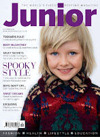 An ideal reader for this magazine would be a middle aged woman/ mother. She would most likely be eating cereals - Special K for breakfast as they would be trying to loose weight from their pregnancy. they would also drive a people carrier car as they may have more kids alredy and it is a family car. the woman reading this magazine would probably live ina 4 bedroom house, and in her free time would watch family shows and possibly carttons because of her kids. She would also want her family eat heathy and organic food, and most probably choose family holiday resorts to go over the summer.
Wednesday, 6 October 2010
Analysing Movie Posters
Kick Ass
 The teenager - main character in this movie is represented in a stereotypical way as he is holding a weapon; appearing as if he was fighting. That's why the poster is designed in such way that it embraces violence rather than becoming a superhero. This is because most teenager enjoy watching movies with a violent content.The poster also includes other characters from the movie,which are perfectly portrayed by the clothes they are wearing. The main character in the green - symbolizes energy and balance, learning and growth as he is trying to become a superhero and save lives, Hit girl wearing purple which can be explained as the colour of royalty and power as she is illustrated as the strongest figure. Furthermore there are two more characters : Big Daddy in black that symbolizes death and red that stands for danger as the character Red Mist betrays Kick Ass . The layout of this poster is very successful as the background contrasts with the title which contrasts with the characters, and that way everything is seen clearly.
American Pie
 This is a typical teenage movie about male friends who have a very high interest in sexual activities during the spring break, which is the main stereotype in this movie. However, there is also one counter type- which is one of the boys. This is because he already has a girlfriend and does not behave like his other three friends.

American Pie

Tuesday, 5 October 2010
Pictures
Today I have taken some pictures in the art department in my school, so that it would give me an idea of what my front cover may look like. I have also set up a still life images and used photographs I have taken before and pictures of my art work which I did last year, as they can be very useful to me in the future and i could also use them in the content page.


SURVEY 2
Motto/Slogan for the magazine COLOURS
I have questioned some people about the possible slogan of my magazine, which i would place under the title within the masthead, and these are the results:
Each is important = 4 - because it puts everyone in a equal position.
Creation Always Varies = 12 - because art is all about creating and developing new things.
Different makes a Difference = 8 - because its catchy and interesting.
As most students voted for Creation always varies, I'm going to use it as the slogan.
Wednesday, 29 September 2010
Designing the title
In this lesson I have started designing the title of the magazine. Firstly, I researched different websites for font generator and I found http://www.dafont.com/ to help me find an appropriate font for my title. However, before I decide which title I'm going to use, I will create another survey for the magazines motto.
 |
| I used decorative font and changed the colour of each letter. This is so that the different colours show the variety of the students. Moreover, this title would only be clear to read if the background image I use will be black and white or edited so that it contrasts with the title. |
 |
| Considering that the first title I have designed is most likely to ''blend in'' with the background image, I only changed the colour of three letters so that the whole title could be seen clearly. Furthermore, if I was to use this design, I would change the green letter to yellow for the effect of using the primary colours. |
 |
| In this design, I have left the font sharp,clear and single coloured, because I added loggo to the title - palette, which is colourful and gives the design a simple but profesional look. However, if I chose this design I would try changing the font so that it appears more artistic. |
Subscribe to:
Posts (Atom)